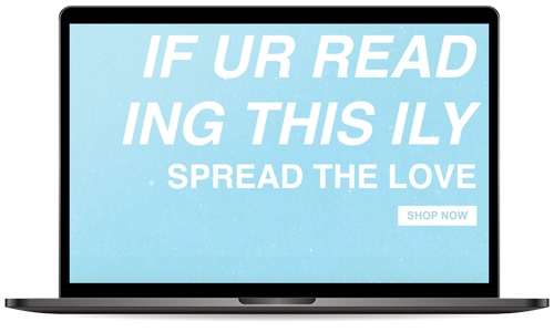
For this website, shortened to be IURTILY, I chose a very basic color scheme of a light blue, as well as a light pink and green as secondary colors. I also decided to keep the design to a very minimalistic approach so that it would look more modern and focus on the message rather than the product. As I discussed briefly in my self care app, I got my idea from the We're Not Really Strangers concept and social media. My target market for this would be younger people ages 16-25 of all genders and ethnicites. This demographic is very fond of vintage-looking apparel, so I wanted to keep my font choose to a very simple sans-serif option. This website is also very to the point because the focus is only on one message rather than many different products.

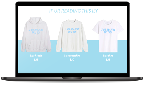
For the catalog portion of the website, I chose to do colorblocking with each of the different colored fonts to stay with that vintage feel that most people in my target market enjoy. For example, the blue hoodies lead into the blue background. The next color hoodie is pink, which will lead into a pink colorblocked background. I also decided to keep all the fonts the same for the title, the products, and the description to keep the design to a minimum to create a very clean page.

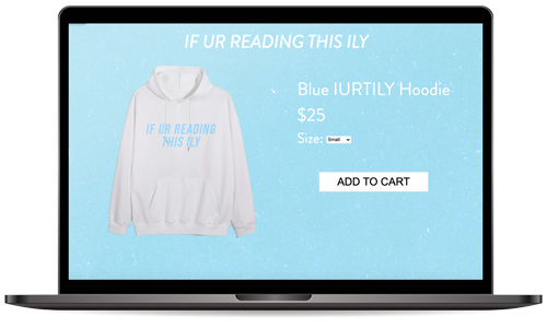
The last part of this website is the item description and call to action. I used the same blue background as the landing page to keep it consistent since this background also takes up the whole page. Since the hoodie speaks for itself, I chose not to give it a large description and keep to the minimalist design. This website would be very targeted towards younger people, especially on social media sites like Tik Tok. Influencers often do sponsorships with websites such as this because the brand is so targeted and can create lots of traction in one place.