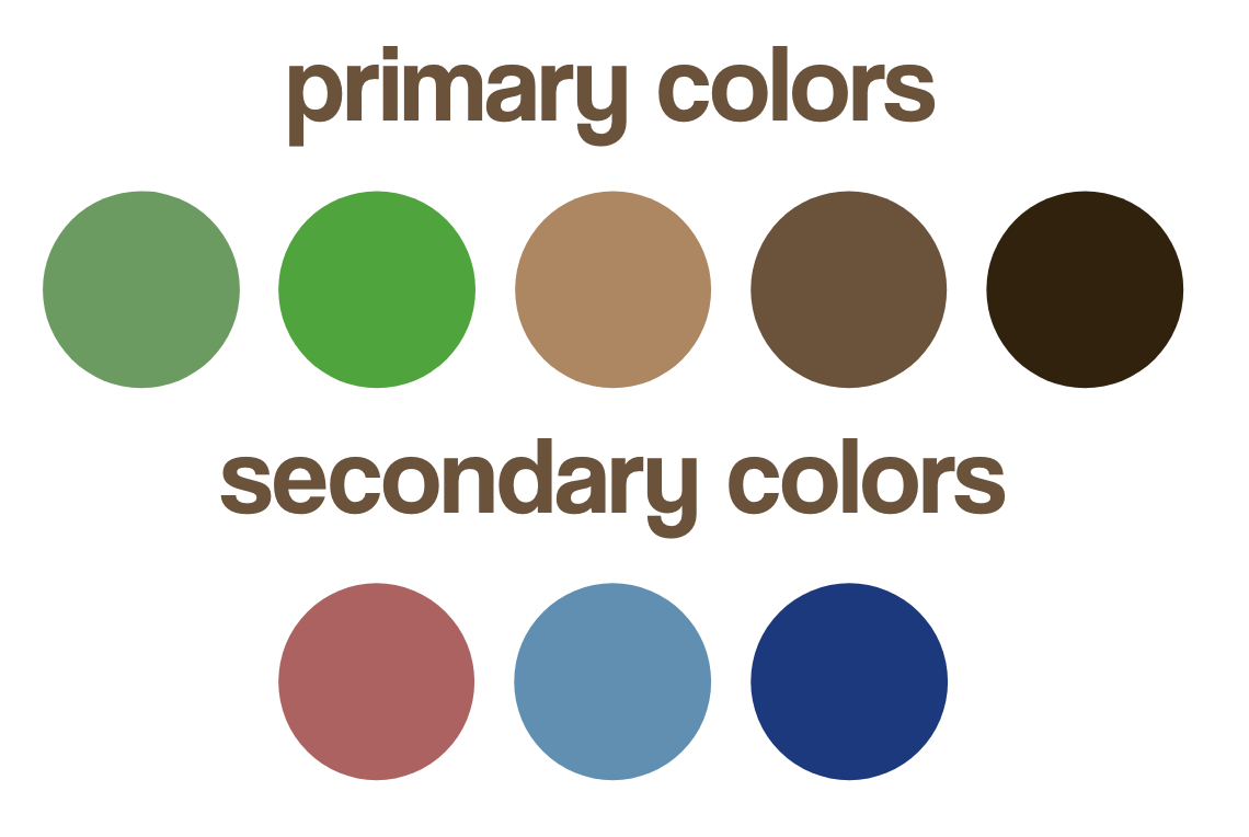
For Coffee Grow, I decided on green and brown as my main colors because they are cnnected to earth and nature. I want my coffee shop to be seen as a sustainable source, similar to the ground with earthy greens and browns. I also decided on a couple other colors to add for different occasions. Reds and blues add to the natural tones of the store, while being a little bit more muted.

For fonts, I chose coolvetica as the main font for the logo and headlines. I wanted to keep a simple design for the logo and incorporate the coffee bean so that it would look very clean and represent the coffee shop. I also chose to stay with a similar font for the second headline copy, using helvetica so that the designs would be consistent, as well as social media posts, posters, etc. Lastly, I am using SF Pro Display as the body copy to be consistent with the font most apple products use because the simple font allows for clean designs.

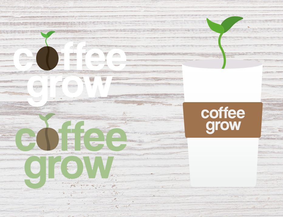
Lastly, for the branding of Coffee Grow, I designed a simple logo to be used in a white or green font. I added a coffee bean with a sprout to symbolize the sustainability of our coffee, which is also seen in the secondary logo with the coffee cup, which would most likely be seen in advertisements and on social media.